Showing posts with label Secondary Research. Show all posts

Monday, 2 May 2011

Post 37- TW Cen

The typeface Twentieth Century (abbreviated to Tw Cen in font menus) is used as the typeface to accompany the symbols wherever they are used. As a solid, geometrically formed face it accords well with the aesthetic of the symbols and, to my eye, somehow seems to have fewer of the quirks (if you ignore the some of the counters in the lowercase characters in the regular weight) that can make similar faces like Futura and Gill Sans jarring in places.

Being minimal in nature, it also fits in with the ethos of the system that the sound is the defining force that shapes the visuals. If I were to use an ornate, or heavily idiosyncratic typeface, the type would become too much of a defining feature in itself.

Friday, 29 April 2011

Post 34- The Mathematics of Electronic Music

This concise, beginner-friendly essay by Peter Elsea was useful in helping me understand more of the technical aspects of music analysis. The below illustration included in it really was worth a thousand words in explaining sine waves and Fourier transforms, not the most artistically drawn piece of work but exceptional use of metaphor to elucidate an idea that seems esoteric when described only in words.


In addition, this page on the Adobe Soundbooth help section also explains well, some fundamentals of digital audio.

Post 33- Music Sampler


In undertaking this project, I initially had no idea how I was going to procure the data from music to create the symbols so I met with my friend and aspiring programmer and artist Louis Eguchi seeking advice on how to go about this. Before long, him and his brother Nat (also a programmer and artist, with whom Louis often collaborates) had started writing me a custom application called Music Sampler, which takes measurements of sound levels from .mp3 files at specified intervals and writes them to a spreadsheet. 

This neat app allowed me to be flexible in my experimentation with representing this data, as opposed to an automated generative system. 

View Nat and Louis's blog full of awesome projects (the music drawing app might steal a few minutes off you), random scribbles and good music here and follow them on twitter.

Post 32- Peter Saville

Though I hadn't consciously referenced the work of Peter Saville in creating the visual system, somebody observed that his influence is evident within it and retrospectively I can also see this. This is not surprising however as Saville's fame as a designer is founded on his imagery for various music artists' album covers; imagery which has shaped visual language about music.

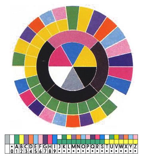
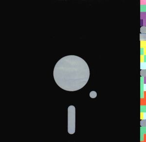
My system of symbols is most apparently linked to the key to his coded alphabet adorning the sleeve of New Order's Blue Monday. Though this link is not profound (it is a key to a code, rather than the code in itself and describes the alphabet rather than music), you can draw some parallels between the circular composition, importance of colour and relation to language.


Saville's coded alphabet key and alphabet code implemented on the Blue Monday sleeve.

Monday, 18 April 2011

Post 28- Robert Corish

An interesting installation by Robert Corish harnessing the physical vibrations of sound to create a projection of fluctuating patterns of coloured light. His site is full of other fascinating generative projects that bridge the gap between art and science.


Post 27- Key and Colour

Simple graphic showing the relationship between colour and key:


Post 26- Key Charter

Charting is a web app that uses data from the Echo Nest (a music analysis company which creates databases to power music applications) to create a simple a infographic that demonstrates the key most used by an artist. This is quite closely related to what I want my system to produce, in that it is very easily comparable. However I do want to represent a little more detail (I will include data from more aspects of the music) and think that the visuals should be more variable and contain some cues to suggest what information is evident in them.

Post 25- Tune Glue

Though it is driven by the algorithms that connect and recommend 'similar' artists that I have previously slated a bit on this blog as a way of finding new music, TuneGlue is well realised and entertaining as a way of presenting proximity between artists.  


Post 24- Musicovery

Although it's pretty impossible to quantify which music suits a given mood or emotion (because what someone will want to listen to whilst in a certain state of mind is entirely subjective), Musicovery is a site with a nice interface that allows you to listen to a host of radio stations matched to 4 distinct moods: Positive, Dark, Energetic and Calm (and the shades of grey in-between).

I think the idea is executed well and you can discern a quite general change in mood of the music when moving the cursor over the grid but, like anything that tries to categorise the mood of music, it is by no means perfect. A case in point is when i scrolled over the bit between 'positive' and 'energetic' and it played Jimi Hendrix's song Manic Depression.

The playful feel of it and ability to seamlessly flit through 117 tracks makes it possible to discover new music but mostly I just end up entertaining myself with it by mashing together death metal and jazz.

This interface is just a single feature of the site however and it does contain a Pandora style 'similar artist radio' but as mentioned before on this blog I don't think these algorithmic recommendation systems are brilliant tools for finding new music.


Post 21- Edward Tufte

Though I am not creating 'infographics' in my system for visualising music, (read the post on Isotype charts) I followed up a reference in Erik Spiekermann's book review (mentioned in the Isotype post) to Edward Tufte.

Tufte is an influential thinker in the field of information design who advocates a selective approach to data-based design with the elimination of any elements that do not contribute to the audience's understanding of the implications of that data (this is summed up by his term, 'chartjunk').

One idea that he is an exponent of, summarised on his Wikipedia page, struck me as being salient in general and particularly relevant to this project:


Tufte also encourages the use of data-rich illustrations with all the available data presented. When examined closely, every data point has value; when seen overall, trends and patterns can be observed. Tufte suggests these macro/micro readings be presented in the space of an eyespan, in the high resolution format of the printed page, and at the unhurried pace of the viewer's leisure


These sound like a good set of guidelines for visualising music, as I think to be able to compare the sounds visually with one another, my symbols will need to be adept at showing overall trends and patterns.

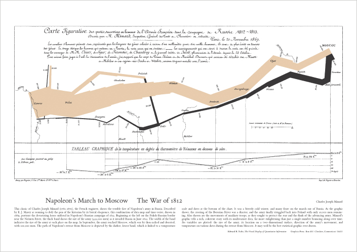
Below is an example of what Tufte brands 'the best statistical graphic ever drawn', a diagram of Napoleon's Russian campaign and subsequent retreat that gives the viewer a laconic insight into the fortunes of the campaign with the width of the line representing the dwindling number of men in his army.


Post 20- Transforming data into human stories

Erik Spiekermann's review of the book The Transformer: The Principles of Making Isotype Charts in Eye magazine makes some pretty pertinent points about the process of encoding data in graphics. The subject of the book he reviews is Otto Neurath's work in developing a style of data presentation which maintained the connection between the actual data being shown and the visual. The principles of Neurath's Isotype charts advocate the tailoring of the visual to the data it is representing to create a piece which can be understood as intuitively as possible. 


Neurath developed the notion of ‘the transformer’, as Robin Kinross writes in his preface, ‘to describe the process of analysing, selecting, ordering, and then making visual some information, data, ideas, implications’.


A crucial difference between my visual system and infographics is that the symbols are not intended to be transcriptions of the absolute music data which you could read a key to understand, rather they are a visual language for comparison and observation to be understood in relation only to one another. 


The arbitrary nature of languages means that the symbols created by my system could take nearly any form, as long as they make differences apparent. 


However, to give the user of the system some clues as to what is being signified in specific differences I will firstly draw on existing visual language and, more importantly, give them some reference points for translation in the form of well-known songs visualised through the system in the contexts in which my symbols will appear.

Post 18- Visual Systems of Difference

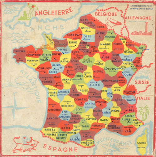
Typefaces, maps and flags are all examples of visual languages that make differences within an overall paradigm very apparent and easily fathomable and serve as good reference points for what I aim to create. However, I need to bear the subject- music- in mind when forming the visuals as the aforementioned languages are (mostly) purposely reductive and this is somewhat at odds with the rich, diverse art that is music. Within this dichotomy of richness vs reduction is a balance which needs to be observed in my symbols.


The above typeface is a nice redrawing of Futura I stumbled across on Hetttty's blog, a collection of graphics and illustration by Belfast-based design student Heather Browne. 


Sunday, 17 April 2011

Post 15- Robert Horvitz Drawings

Found these beautiful drawings of patterns and structures by Robert Horvitz. It was something close to these which I originally envisaged I would use music data to create, however, aesthetic though they are, I have to factor in that want I want to create is a rule that will generate a series of (hopefully) comparable, contrastable objects and for this purpose the intricate details of this type of visual are not appropriate. 


Post 14- Feltron Blog

The Feltron blog is a constant stream of visual inspiration for anyone with an interested in rules-based, generative or information design. It's helpful to see successful examples of other designers selecting, ordering and representing information. Below are some recent highlights posted to it.


Post 10- Stephanie Prosavec

On a recent visit to the brilliant Pick Me Up exhibition of contemporary graphic art at Somerset House, Stephanie Prosavec's work really stood out as an important reference point for this project. In creating a visual system to represent music data my project shares a similar premise to some of her visual systems work, particularly that of the Literary Organism, a chapter of Jack Kerouac's On the Road broken down and translated into a sprawling structure that resembles a conglomerate of beautiful linear florae. 

Where my project differs is that, while Prosavec has created some great one-off pieces using her systems, I hope to create a system that can allow for comparison and observation of patterns that may help users get an intuitive idea of what the music may be like. Therefore, to help make the system able to fulfil this function effectively, I will need to be slightly selective with the data; too much information will make each symbol hard to compare to one another, too little and the ability to express difference will be lessened.

Post 8- Soundcloud

The music streaming website Soundcloud features a visualisation of each song embedded in its player panel which allows a certain degree of visual comparison. 

For making a quick, intuitive comparison as required by my visual system, they do not work as well as the sheer amount of information distilled into a long timeline style shape creates a level of detail that makes the observation of general shapes and patterns more difficult than if it were simplified. 

The long format is definitely something I will try and avoid and will try to find a way of compressing a timeline into a shape that could fit well into a square grid as this is would be more suited for presenting elements of a system of difference.     

For Soundcloud's purposes however, they work well and are interesting to watch whilst listening to the music.