Showing posts with label Primary Research. Show all posts

Monday, 2 May 2011

Post 35- Tweaks

In my attempts to create the final set of symbols to demonstrate the visual system it became clear that the rule needed to be honed to produce symbols that were readable (in the sense of making clear the data from songs) and that, from feedback on some of the first iterations, some kind of device was required to designate clearly, the beginning and end of each song.


The first rule I used produced some symbols that were too dark to be able to make sense of the inherent patterns and structure in the song. The base colour is also obscured by the cloudy layer above it.


Attempt to remedy the problem of base colour being obscured by framing the symbol with base colour (on a different symbol). The top layer (sound levels information) is still quite murky, indistinct.


Changed the rule so that sound levels are expressed within a lower range of top layer opacity levels. This creates greater contrast and makes patterns and structure much clearer and allows the base colour to become more visible.


Symbol with amended data range and an early attempt at showing where the song starts. This is overbearing and dominates the subtle shades that describe the data.


This disrupts the symmetry and and essential shape of the symbol too much.


This is more harmonious with the shape yet still distinct enough to delineate the start/end.

The frame was removed as it was kind of an unnecessary distraction from the data as the small circle in the middle shows the pure base colour.  

Friday, 29 April 2011

Post 33- Music Sampler


In undertaking this project, I initially had no idea how I was going to procure the data from music to create the symbols so I met with my friend and aspiring programmer and artist Louis Eguchi seeking advice on how to go about this. Before long, him and his brother Nat (also a programmer and artist, with whom Louis often collaborates) had started writing me a custom application called Music Sampler, which takes measurements of sound levels from .mp3 files at specified intervals and writes them to a spreadsheet. 

This neat app allowed me to be flexible in my experimentation with representing this data, as opposed to an automated generative system. 

View Nat and Louis's blog full of awesome projects (the music drawing app might steal a few minutes off you), random scribbles and good music here and follow them on twitter.

Tuesday, 19 April 2011

Post 30- Final Developments

Having rejected the blobby, idiosyncratic shapes generated by previous rules, I sought to strip my generative symbols down to something that would allow the user to gauge each sound's proximity to the next. The most immediate way of doing this, used universally to differentiate visual information in contexts such as tube maps, encyclopaedias, filing systems and electronics, is colour coding. Rather than the shape creating the point of difference, I would use the more immediately comparable medium of colour. 


In each symbol, there are a number of segments which correspond to intervals in the song where measurements of sound values are taken, this value determines the colour for that segment. The top image is one I experimented with, whereby changes in tone and bpm over time dictated the change in hue, however I felt that this was too similar to a pie-chart as the hue changes were the most dominant aspect. Giving the symbol a single hue, and communicating the differences in sound values through variations within that hue creates a much more readable visual and, I think, a more pleasing aesthetic.

Sunday, 17 April 2011

Post 16- Visual Testing

If I was to create a system that showed proximity between songs, it would need to have a modular framework within which difference could be expressed. I started to experiment with mapping the data around a circle (which conveniently alludes to a staple of visual language about music- the disc format and simultaneously, a clock, which would allow me to represent values against time in an easily understandable way), using sets of lines radiating out from a centre point with varying lengths to show different values. I tried several variations on this theme and received positive feedback on some of the results. However the capacity for these symbols to show difference was questionable, each one was too blobby, too indistinct which would make difference between them hard to fathom without studying them. 

The system needed to be more immediate and intuitive than this, with the viewer hopefully being able to spot differences instantly.


Post 13- Testing Continued

Just a couple of quick tests with different arrangements of the waveform. I probably won't pursue this idea as it isn't really viable as these are massively simplified versions of the wave's curvature and do not say much about the sound, though I do think they have a pleasing aesthetic that could be developed.


Post 12- Visual Tests

The first visual tests I did were based on an idea that the song data should be able to generate a distinctive shape. I tried to think of other ways of doing this than just an X, Y coordinate system, where the value determined the placement of a series of points which would be joined to create this shape. I tried out some web-like patterns but as pretty and organic as they looked, they all ultimately resembled mesh-like patterns and would have been pretty hard to compare with one another as the data was visualised only in very fine detail. 

Next I tried a method of taking a shape and using data (which at this point was placeholder data of random numbers from the really useful and interesting site Random.org as I had yet to find out how to extract data from music) to determine the placement of it in relation to the previous shape (eg for a square, if x=3 then place the next square adjacent to side 3). This required some more complex rule-making but produced some interesting, clustered formations of shapes. However, this rule eventually failed when it became apparent that two songs with the same data except for 1 value could end up looking very different as each value had a big impact on altering the course of the shape development.  

My focus, after these first tests then shifted onto making a system that could show proximity, in which songs with like data would look alike and different songs would look different.


Post 11- Sound & Programming

I approached this project of converting music into visuals knowing little about the technical aspects of the former. Having never played an instrument, I've only ever enjoyed music as a listener and was therefore unfamiliar with some of the terminology I came across when reading certain articles about how sound can be interpreted visually. Other terminology I had heard, but did not wholly understand, for example 'decibels', a unit for measuring sound that is logarithmic (another term I needed to clarify). The Fourier transform is something I'm currently trying to get my head around as it is one way in which visuals to describe sounds are generated (such as Spectograms) and in the process, I have been led down a rabbit hole of other terms and concepts that are used to define it such as sine waves, oscillation and resonance.

It also became apparent pretty early on that, for my visual system to viably be able to generate visuals for any meaningful number of sounds, I would need to learn some kind of programming to create something that would help generate either the data for me to use to create the shapes in illustrator or ideally to generate the shapes themselves. Since I have as much expertise in this as I do in music, I sought advice and help from Louis Eguchi, a creative programming genius who is in the progress of creating some software that will make it possible for me to create a decent number of visuals. 


Post 6- Rule Sketches


Post 4- Visual Brainstorming

Some of the ideas conceived during the ideas generation process included using data to create an illustrated landscape or a creature/organism and looking at the idea of the data building a structure alluding snowflakes and minerals. Whilst the former were maybe too gimmicky and had strong connotations inherent to them, the latter ideas of looking at structures that occur in nature merited a little more experimentation and it was these that I had in mind in doing my first visual tests.    


Post 2- Essay- Growing Trend for Flexibility in Visual Identities

Back in January, I wrote an investigative essay on visual identities broaching the subject of the contemporary shift away from the more traditional form of static identity design in favour of more flexible approaches which encompass visual systems, generative design principles and the creation of distinctive visual languages.

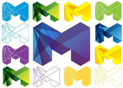
It discusses these points with reference to case studies on the London 2012 logo and Landor's dynamic identity for the city of Melbourne (below) and can be seen as a kind of precursor to, or foundation for the work in this project.