
Tufte is an influential thinker in the field of information design who advocates a selective approach to data-based design with the elimination of any elements that do not contribute to the audience's understanding of the implications of that data (this is summed up by his term, 'chartjunk').
One idea that he is an exponent of, summarised on his Wikipedia page, struck me as being salient in general and particularly relevant to this project:
Tufte also encourages the use of data-rich illustrations with all the available data presented. When examined closely, every data point has value; when seen overall, trends and patterns can be observed. Tufte suggests these macro/micro readings be presented in the space of an eyespan, in the high resolution format of the printed page, and at the unhurried pace of the viewer's leisure
These sound like a good set of guidelines for visualising music, as I think to be able to compare the sounds visually with one another, my symbols will need to be adept at showing overall trends and patterns.
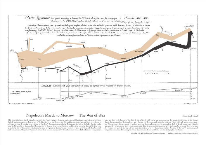
Below is an example of what Tufte brands 'the best statistical graphic ever drawn', a diagram of Napoleon's Russian campaign and subsequent retreat that gives the viewer a laconic insight into the fortunes of the campaign with the width of the line representing the dwindling number of men in his army.
No comments:
Post a Comment