Showing posts with label development. Show all posts

Friday, 29 April 2011

Post 33- Music Sampler


In undertaking this project, I initially had no idea how I was going to procure the data from music to create the symbols so I met with my friend and aspiring programmer and artist Louis Eguchi seeking advice on how to go about this. Before long, him and his brother Nat (also a programmer and artist, with whom Louis often collaborates) had started writing me a custom application called Music Sampler, which takes measurements of sound levels from .mp3 files at specified intervals and writes them to a spreadsheet. 

This neat app allowed me to be flexible in my experimentation with representing this data, as opposed to an automated generative system. 

View Nat and Louis's blog full of awesome projects (the music drawing app might steal a few minutes off you), random scribbles and good music here and follow them on twitter.

Wednesday, 20 April 2011

Post 31- More Final Developments

The rule for the final set of symbols was developed with thought into what the equivalent visual characteristics of the sonic properties I am using are. Instead of trying to exhaustively try to describe the sound with the visual (this can never really be achieved by anything other than the sound itself) the system is intended to be an indicator of its fundamental attributes. The properties I used for my data are: most frequent pitch, most frequent key, mean tempo, dynamic Db information (values taken from the waveform that visualises the song's electronic signal, these are taken at specified time increments and are useful, like the waveform at indicating patterns and rhythms) and song length.

My research into these aspects led me to link the following sonic and visual properties: 

Key (most frequent) = Hue. Hue can be equated to Key as both are known to strongly influence the mood of a piece. I defined 14 separate hue classes for each Key class (C,D,E,F,G,A,B) and their sharps and flats. The frequency of each key corresponds to the frequencies on the spectrum of visible light.

Pitch (most frequent) = Warm or cool shade added to the hue. The higher the frequency of the sound, the higher percentage of blue added to the initial hue. The lower the frequency, the more orange (mix of magenta-yellow) added to the initial hue. This corresponds to the the spectrum of visible light and acts in a similar way to sound as, just as different pitches exist within different key classes, different ranges of hue can contain an array of variations. 

Tempo (Mean BPM) = This is reflected in tint and influences the colour variable for Db values. Tempo generally determines whether a song sounds vivacious, natural, mellow or languid whilst the tint value of a hue can make it seem vibrant, normal, washed out or insipid. A high tempo will result in an untinted hue whilst a slower one will see a greater amount of white added.

Decibel Information = The sound's waveform, measured in decibels against time reveals the sound levels and is a very good indicator of patterns and structure. This is interpreted by my visual system in an opacity mask which takes a dark hue (determined precisely by the tempo; higher tempo songs will generate a more harmonious hue that will help to accentuate the general hue of the symbol, increasing its vibrancy while a slower song generates a more complementary hue that will make the overall colour more cloudy) and makes it opaque or transparent to a certain extent, depending on the Db value measured at that point. Higher values will be have a higher transparency, allowing the brighter hue underneath to come through whilst lower values will be more opaque. This will create a darkened fade out effect as the sound levels drop at the end of a track which will help to create an intuitive marker of the end (and beginning) of the song.    

Length = A patterned edge to the circle shape shows clearly the number of measurements taken during the song, the longer the song, the finer the pattern and more colour detail within the shape. I am considering whether to vary the general size of symbols based on song length in the final piece, I'm not sure how important it is as a factor.


Monday, 18 April 2011

Post 21- Edward Tufte

Though I am not creating 'infographics' in my system for visualising music, (read the post on Isotype charts) I followed up a reference in Erik Spiekermann's book review (mentioned in the Isotype post) to Edward Tufte.

Tufte is an influential thinker in the field of information design who advocates a selective approach to data-based design with the elimination of any elements that do not contribute to the audience's understanding of the implications of that data (this is summed up by his term, 'chartjunk').

One idea that he is an exponent of, summarised on his Wikipedia page, struck me as being salient in general and particularly relevant to this project:


Tufte also encourages the use of data-rich illustrations with all the available data presented. When examined closely, every data point has value; when seen overall, trends and patterns can be observed. Tufte suggests these macro/micro readings be presented in the space of an eyespan, in the high resolution format of the printed page, and at the unhurried pace of the viewer's leisure


These sound like a good set of guidelines for visualising music, as I think to be able to compare the sounds visually with one another, my symbols will need to be adept at showing overall trends and patterns.

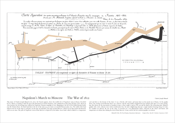
Below is an example of what Tufte brands 'the best statistical graphic ever drawn', a diagram of Napoleon's Russian campaign and subsequent retreat that gives the viewer a laconic insight into the fortunes of the campaign with the width of the line representing the dwindling number of men in his army.


Post 20- Transforming data into human stories

Erik Spiekermann's review of the book The Transformer: The Principles of Making Isotype Charts in Eye magazine makes some pretty pertinent points about the process of encoding data in graphics. The subject of the book he reviews is Otto Neurath's work in developing a style of data presentation which maintained the connection between the actual data being shown and the visual. The principles of Neurath's Isotype charts advocate the tailoring of the visual to the data it is representing to create a piece which can be understood as intuitively as possible. 


Neurath developed the notion of ‘the transformer’, as Robin Kinross writes in his preface, ‘to describe the process of analysing, selecting, ordering, and then making visual some information, data, ideas, implications’.


A crucial difference between my visual system and infographics is that the symbols are not intended to be transcriptions of the absolute music data which you could read a key to understand, rather they are a visual language for comparison and observation to be understood in relation only to one another. 


The arbitrary nature of languages means that the symbols created by my system could take nearly any form, as long as they make differences apparent. 


However, to give the user of the system some clues as to what is being signified in specific differences I will firstly draw on existing visual language and, more importantly, give them some reference points for translation in the form of well-known songs visualised through the system in the contexts in which my symbols will appear.

Post 17- Software

A key piece of music analysis software I have used to obtain music data in this project is Sonic Visualiser, a free program developed at the Queen Mary University of London. It was developed as a visual aid to help musicologists and signal processing researchers study sound recordings and has many features and plugins that were useful to me such as the waveform generator, key detection and tempo detection. Aside from being useful for this project, it is genuinely interesting to use and exploring the myriad ways in which it can output sound into visuals can easily swallow up an hour.    


Sunday, 17 April 2011

Post 11- Sound & Programming

I approached this project of converting music into visuals knowing little about the technical aspects of the former. Having never played an instrument, I've only ever enjoyed music as a listener and was therefore unfamiliar with some of the terminology I came across when reading certain articles about how sound can be interpreted visually. Other terminology I had heard, but did not wholly understand, for example 'decibels', a unit for measuring sound that is logarithmic (another term I needed to clarify). The Fourier transform is something I'm currently trying to get my head around as it is one way in which visuals to describe sounds are generated (such as Spectograms) and in the process, I have been led down a rabbit hole of other terms and concepts that are used to define it such as sine waves, oscillation and resonance.

It also became apparent pretty early on that, for my visual system to viably be able to generate visuals for any meaningful number of sounds, I would need to learn some kind of programming to create something that would help generate either the data for me to use to create the shapes in illustrator or ideally to generate the shapes themselves. Since I have as much expertise in this as I do in music, I sought advice and help from Louis Eguchi, a creative programming genius who is in the progress of creating some software that will make it possible for me to create a decent number of visuals. 


Post 5- Eclectism

The flaws that make stats based music recommendation systems so skewed and limited made me start to consider what, if anything, exists to help people genuinely discover new music. On reflection, one of the richest veins of new music I have come across is Gideon Coe's BBC 6music show. Gid's shows are a marked by a playlist of tracks from a complete myriad of genres and time periods (it's not unusual to hear metal, reggae, folk and swing represented in a single show) framed by the friendly, relaxed atmosphere created by the presenter's affability and dry humour.

I'm sure it is no coincidence that I find more new music through listening to this show than anywhere else (from genres and time periods that, left to my own devices, I would never consider exploring) and that the show is delivered in such a mellow, disarming manner. This, I think, makes the audience generally more receptive to the unfamiliar sounds thus allowing for the genuine discovery of new music, as opposed to finding artists that are unreliably branded as 'related' to one you already like.

Perhaps the aim of my project should not be finding the best way to help people find new music they like, perhaps it is to help facilitate a change of attitude to the kind of open-minded, non-judgemental one which Gideon Coe's shows manage to evoke that make it possible to derive pleasure from listening to almost anything.

Give the show a listen here, or tune in to 6 music from 9-12pm on weeknights, it's an especially good show to get you through those work sessions where midnight oil may be burned. 

Post 3- Music Recommendation Systems

After realising the limitations that are inherent in any music recommendation system, a refocusing of the project was needed. Why did I want to create a visual music recommendation system in the first place? 

The simple answer was that I often got bored of my music or drew a blank when I opened Spotify, wanted to find new, exciting stuff to listen to and found that most of the things that are designed to help do this were pretty unhelpful.

They would often throw up some odd, tenuously linked artist to the one I had started out from. A case in point are the band Biffy Clyro who I have followed from their 2nd album in 2004. They have cited their influences as being from grunge and prog-rock and have been subject to comparisons to artists such as Nirvana, The Pixies, Rush and Fugazi who also used to be among their 'related artists' on Spotify. After their most recent and most popular album though, Nirvana etc have been supplanted by the artists that their new, bigger mainstream fanbase also listen to, so they are now supposedly 'related' to Florence and The Machine, Mumford and Sons and Plan B.

These comparisons say little about the music itself, they are determined by factors like how the band is marketed, which magazines and radio shows feature them and which type of listener takes ownership of them. Thus, unless you are the type of listener who conspicuously consumes music to identify yourself with the groups that are moulded by marketing, these features are not of much use.   

Post 1- Original Concept.

The original brief I set myself was to create a music recommendation system that was fully visualised. I envisaged a set of visual symbols that would be created by the very music that they represented through a generative visual system taking in various aspects of data from it. You would then be able to get an intuitive, immediate overview of different pieces of music and compare or relate those to others. 

In contrast to the majority of recommendation systems that base their recommendations on dominant listening trends and patterns, (such as Amazon and Spotify)  this system would be rooted in the actual sound properties of a piece of music and so would be closer to Pandora, though less comprehensive (Pandora aggregates 400 characteristics for each song) and more indicative.

However, at the point where I started to actually break music down into data and translate this into visuals, I realised just how reductive this process was and, crucially, how no amount of quantitative data (not even 400 characteristics per song) would be able to define an atmosphere, sentiment or meaningfully pre-empt the subjective, esoteric intangible that is personal taste. As a friend summarised neatly in a conversation about my idea, we don't like music because it has X beats per minute- "its just a whim".